.gif)
Sake Matsuri 2026
Singapore

Sake can feel mysterious for many people. Premium but unfamiliar. Traditional but not always easy to approach. Sake Matsuri wanted to break that barrier and make discovery feel exciting, social and full of culture. The brief was simple: refresh the identity, dial up the energy, and draw people in even if they’ve never tasted sake before, all without changing the original logo or signature orange tone.
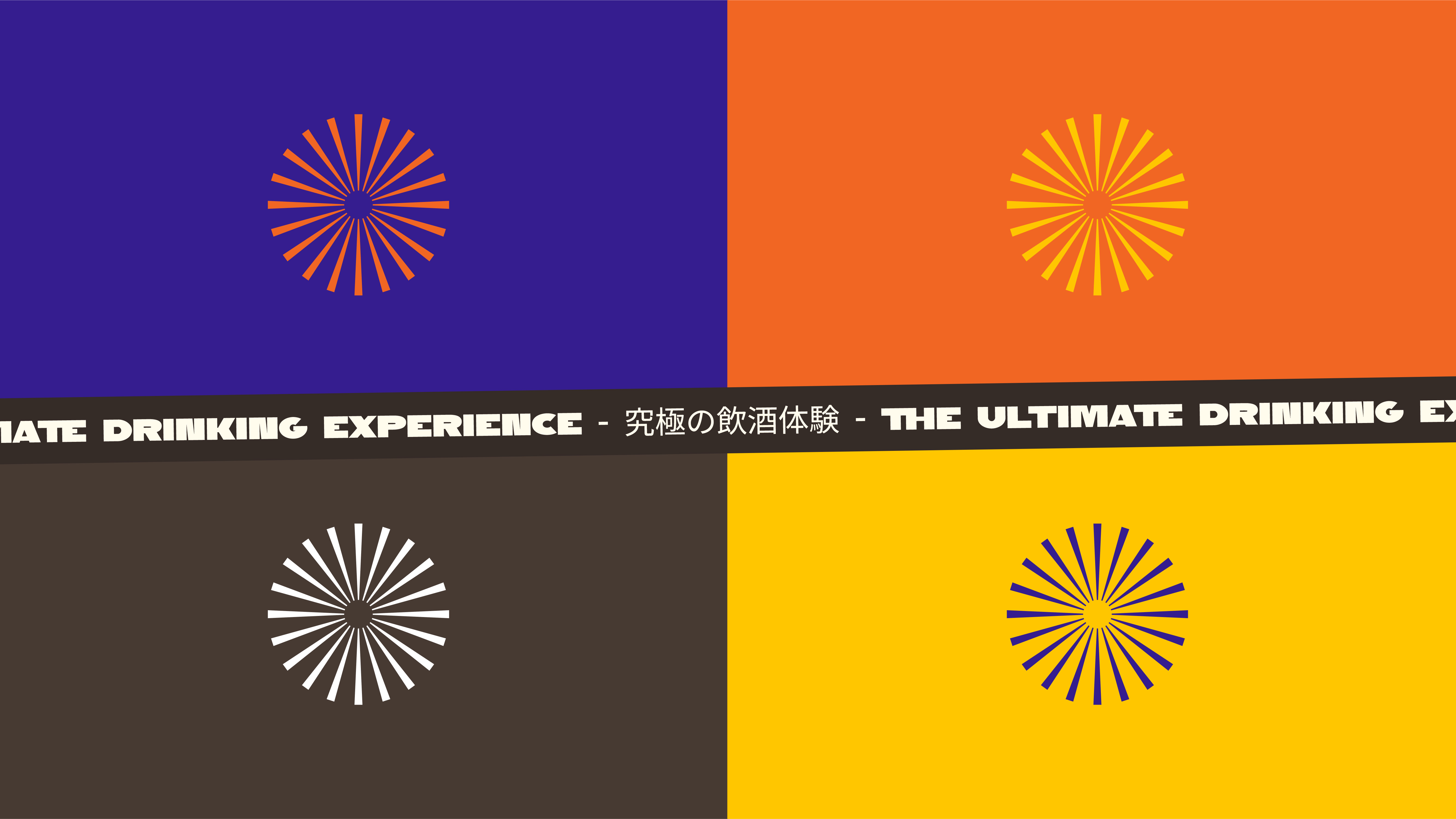
SAY Concepts shaped a vibrant visual world for Sake Matsuri 2026 that feels youthful, curious and celebratory. The identity blends Japanese festival cues with a modern graphic approach that fits how people share experiences today. Bold typography, festival-inspired shapes, warm gradients and punchy colour blocking instantly lift the mood. It sets up Sake Matsuri 2026 to attract younger drinkers, returning enthusiasts and new explorers who just want a good time with good company.

SAY Concepts shaped a visual world for Sake Matsuri 2026 that feels youthful, curious and celebratory. The identity blends Japanese festival cues with a modern graphic style that matches how people share experiences today. Bold typography, festival-inspired shapes, warm gradients and punchy colour blocking instantly lift the mood and spark attention.
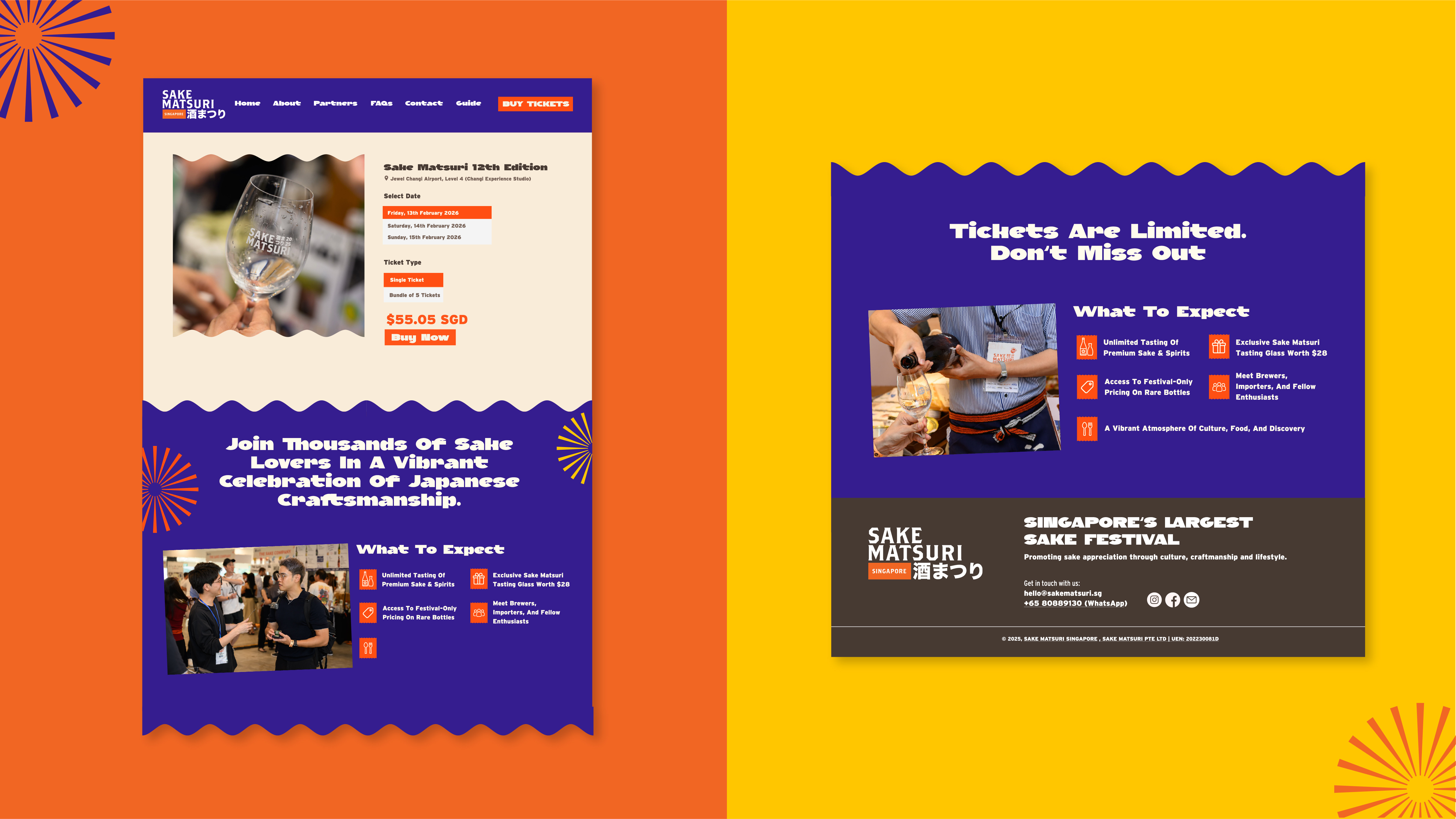
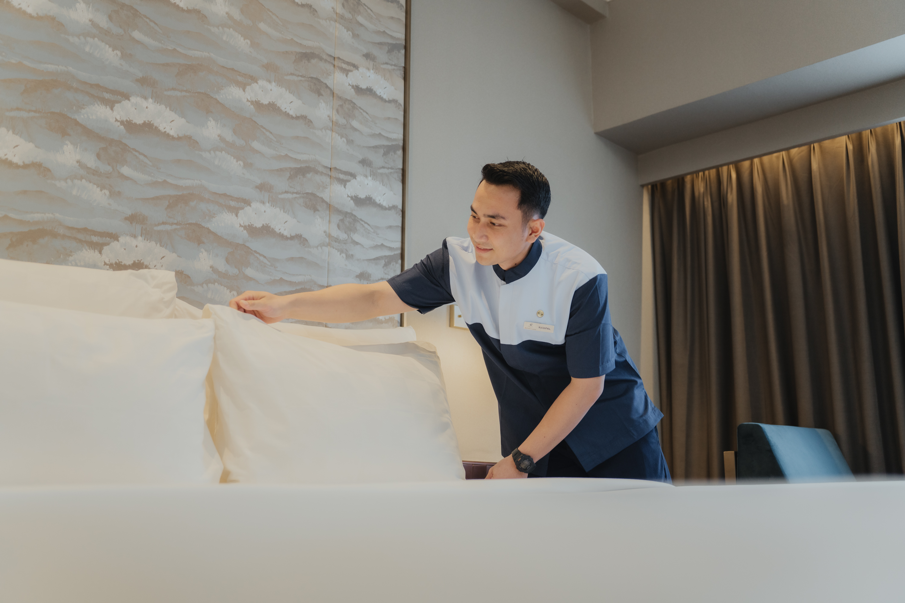
The photography treatment adds another layer of emotion. High contrast black and white images of bottles, pours and real human moments balance against the colourful layouts. This simple contrast makes everything feel more premium, modern and energetic at the same time. The festival copy uses both English and Japanese to honour the culture behind the craft while staying inclusive for local audiences.
Gallery

Reels
Reels
Other Work